
zürcher theater spektakel 2020
normally, the renowned festival for the contemporary perfoming arts attracts well over 100,000 people each year. due to the coronavirus pandemic, it had to reinvent itself. in 2020, for the first time ever, the festival took place in a decentralized manner throughout the city of zurich.


the visual identity uses barrier tape and scenes with crowds of people as main elements. scenes from past editions of the festival are shown, which are guaranteed not to happen this year: densely packed crowds and hundreds of people queuing up. they are crossed out with yellow ribbons, which carry the most important information about the event. the german claim can best be translated as ‹(not) a festival›.

we’ve used barrier tape also as a visual reference to today’s time – since the emergence of the coronavirus, barrier and adhesive tapes have become a part of our everyday lives.




project details
-
normally attracting well over 100,000 visitors each year, zürcher theater spektakel is one of europe’s leading festivals for contemporary performing arts. in 2020, the coronavirus pandemic fundamentally changed the way the festival could take place. instead of gathering audiences at its usual central festival site, the event was decentralised across zurich.
-
the campaign turns the restrictions of the pandemic into its central visual idea. archival photographs from previous festival editions show scenes that would be impossible in 2020: dense crowds and long queues of people. these images are crossed out with yellow barrier tape carrying key information about the event.
the german campaign claim, ‹(k)ein spektakel›, plays with the idea of a festival that is both happening and not happening in its familiar form.
-
yellow barrier tape becomes the defining graphic element, connecting the campaign to the everyday visual language of the pandemic. the contrast between archival crowd scenes and the striking yellow tape communicates the unusual circumstances of the 2020 edition with clarity and a touch of irony.
-
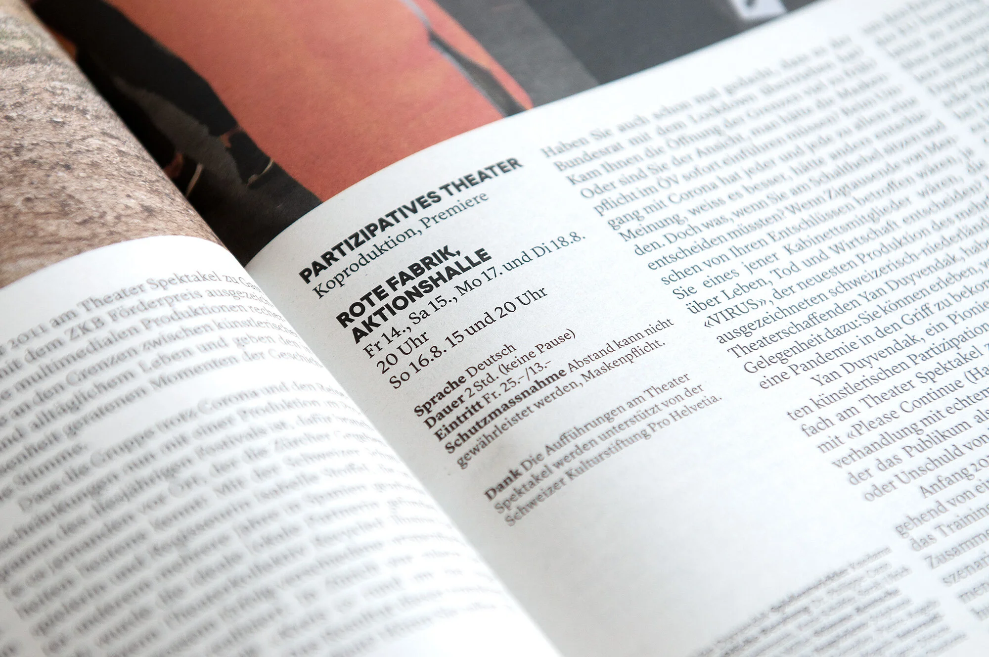
the visual identity was applied across the festival’s communication, using archival photography, bold yellow tape and concise messaging to explain the event’s transformed format. the campaign maintained a recognisable connection to the festival while reflecting the extraordinary situation of that year.
-
a campaign that responded directly to the challenges of the pandemic, turning restrictions into a distinctive visual language. by crossing out images of crowds with barrier tape, the design captured the paradox of a festival that continued in a radically different form.
-
client: zürcher theater spektakel
year: 2020
services: concept development, art direction, graphic design, campaign design, visual communication, animation, print and digital design -
concept, art direction & design: studio marcus kraft, in collaboration with marlon ilg, archival photographs: christian altorfer, kira barlach, layout: michel fries, web development: high five
zürcher theater spektakel: matthias von hartz (artistic director), delphine lyner (executive director), veit kälin (technical director), esther schmid (communication), remo bitzi (digital), susanne azen (marketing), josefine stähli (administration office)