
zurich tourism
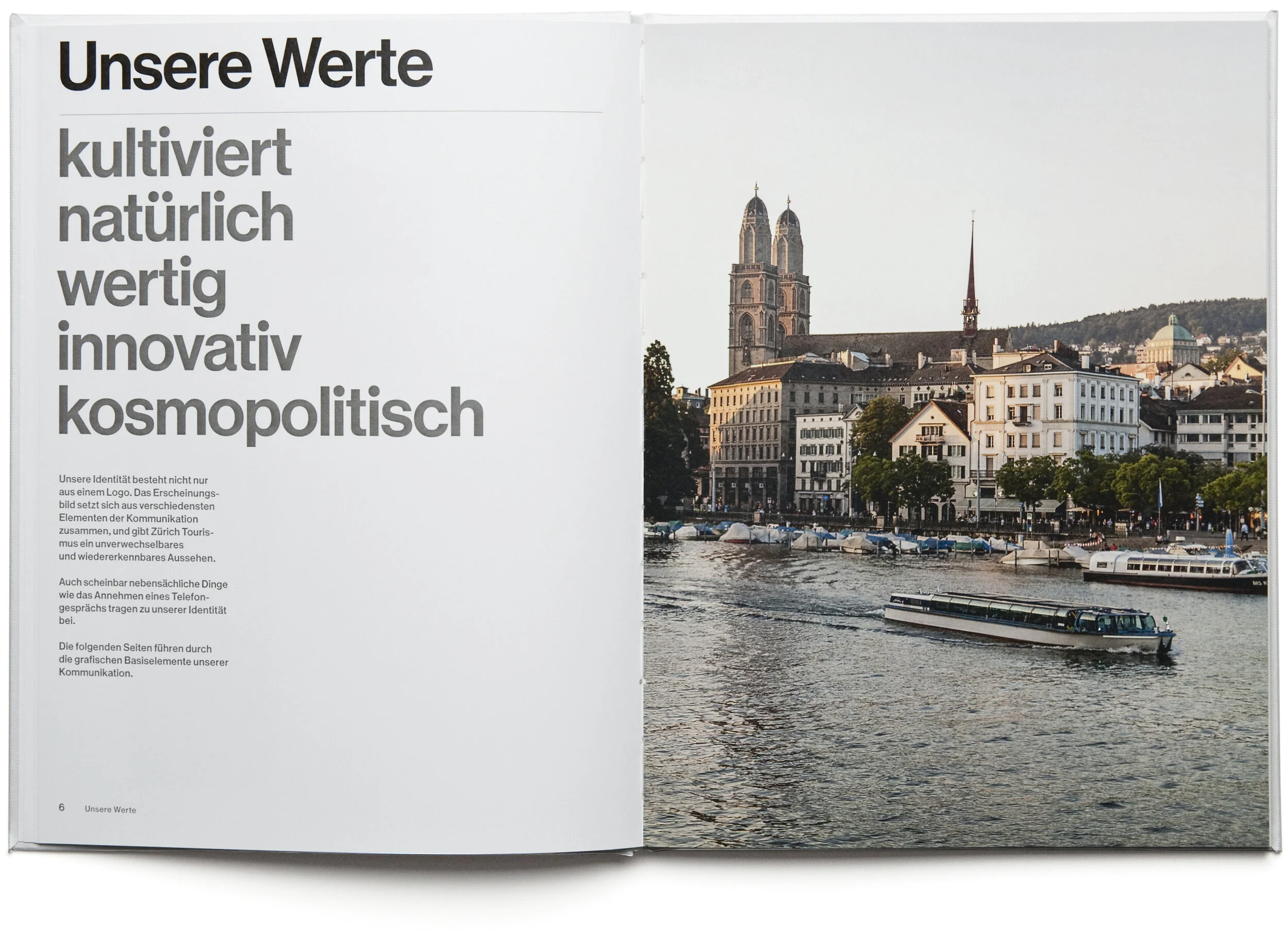
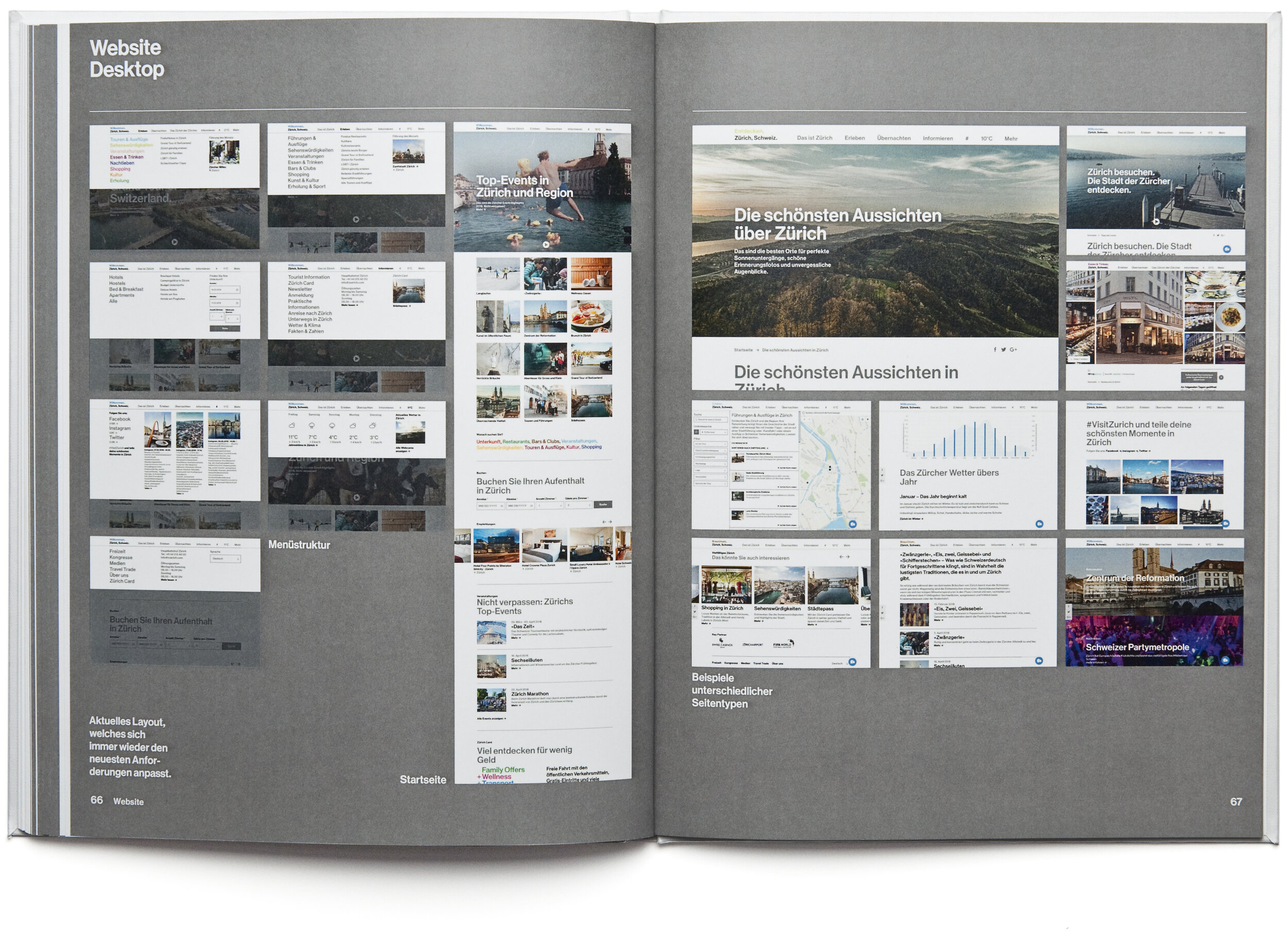
rebranding and corporate identity for zurich tourism. the core concept is a flexible logo system comprising the expandable wordmark ‹zürich, switzerland›. it is a ‹story telling logo› that gives the possibilty of infinite logo variations and interplay with various contents.
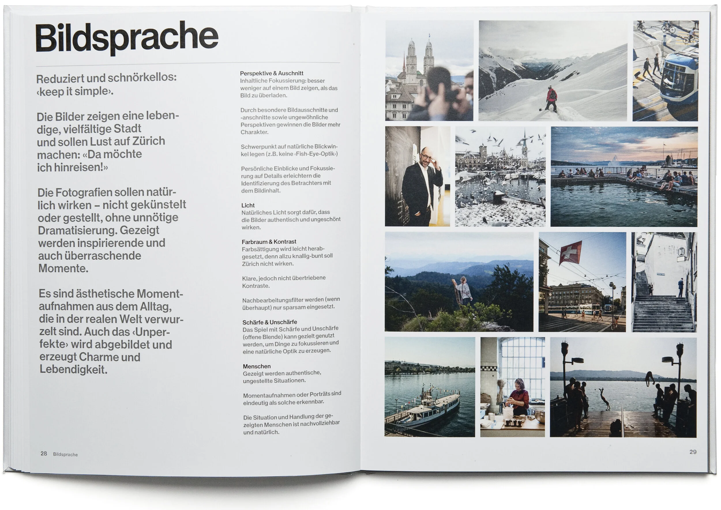
rooted in tradition
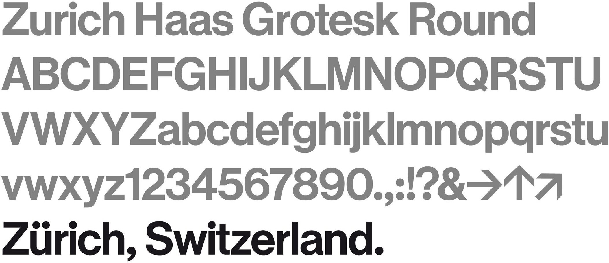
the design refers to the heyday of swiss graphic design in the 60s, where zurich was one of the hot spots. the custom typeface is based on the original helvetica, the ‹neue haas grotesk› which was drawn by max miedinger in zurich in 1956/57.
inspired by the city
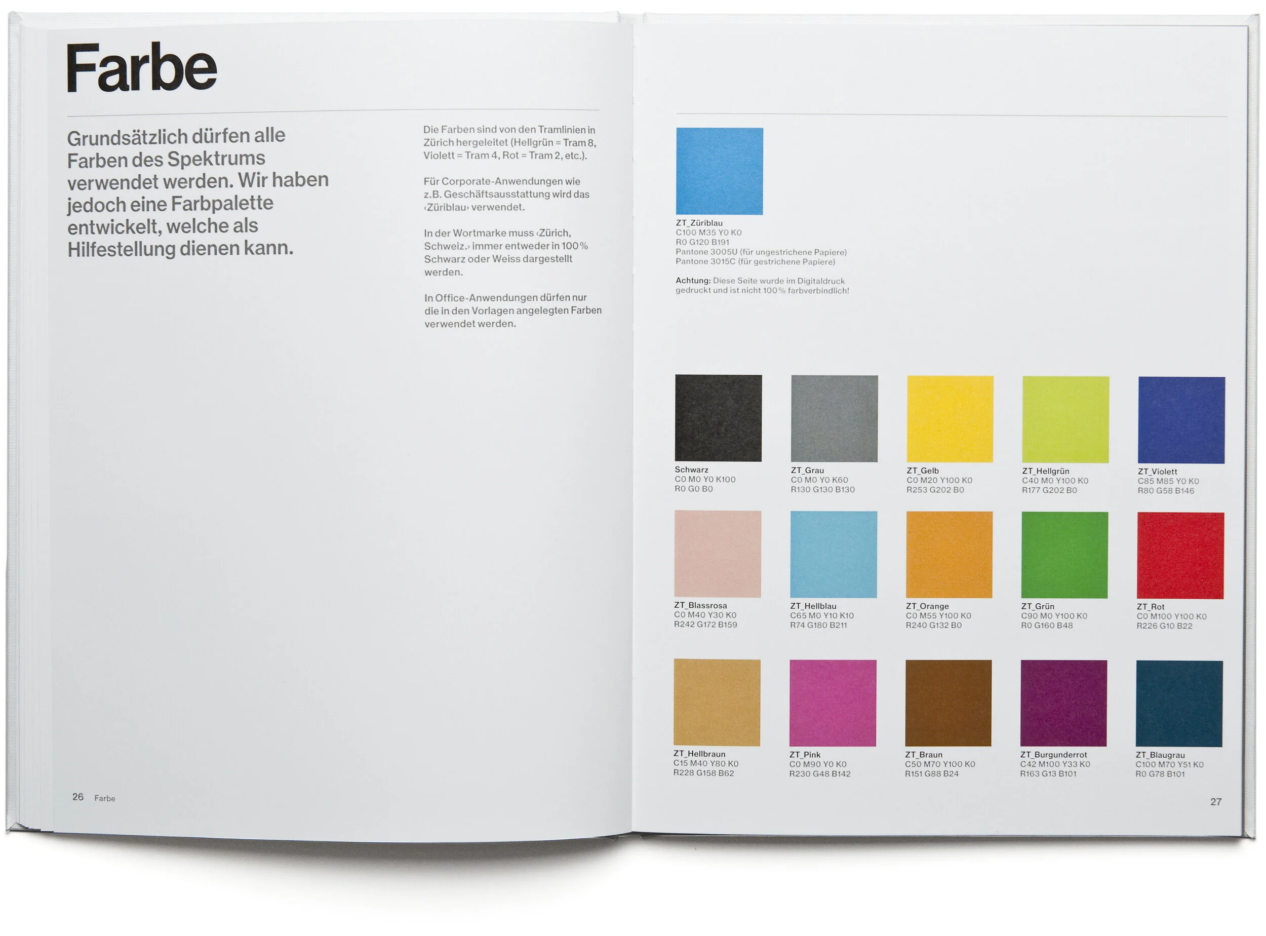
the color palette for the identity is derived from the tram lines in zurich.


highly flexible
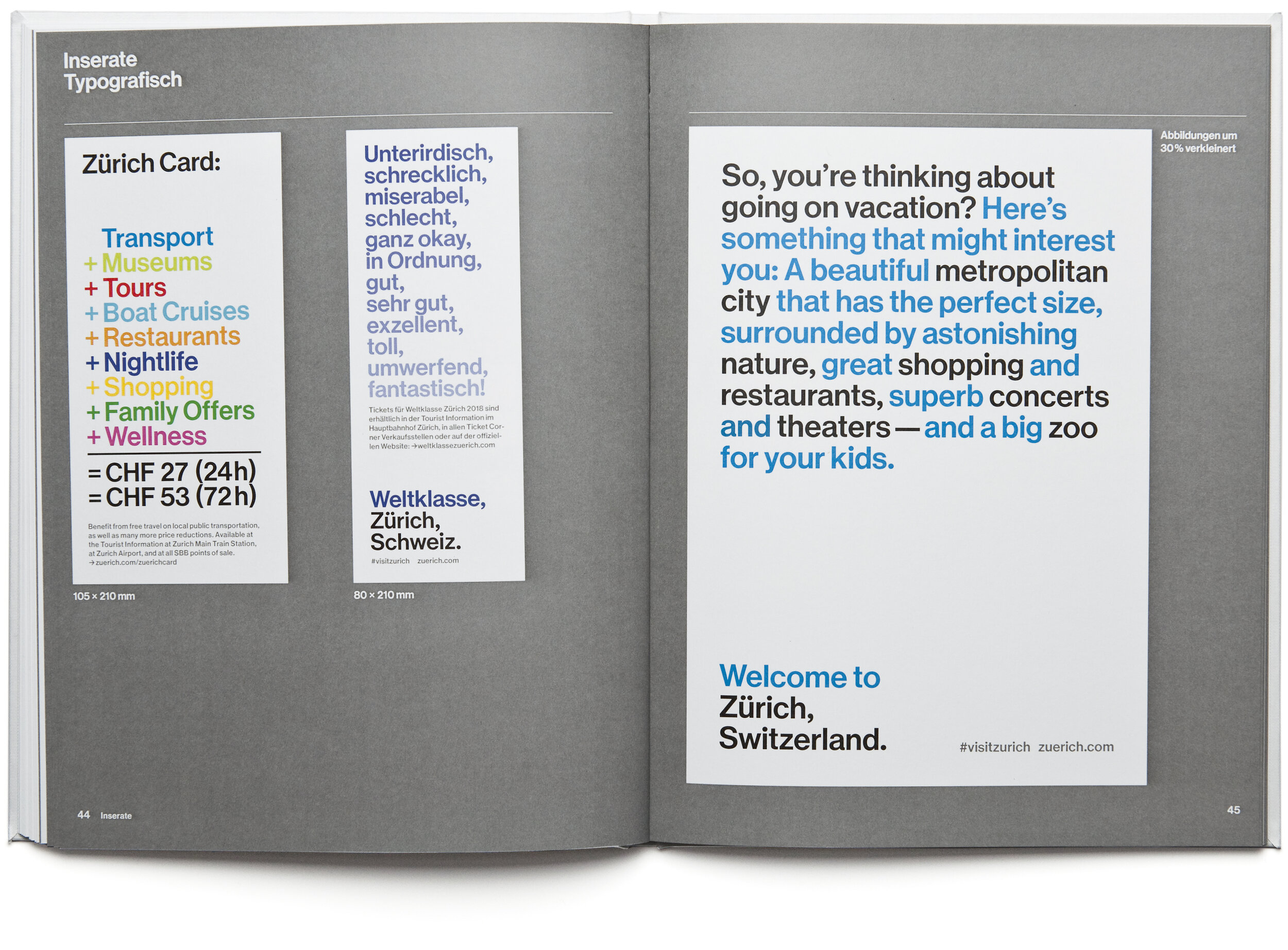
the wordmark can be adapted depending on the message and medium used. for example, each employee’s business card contains an individual personal tip for zurich.


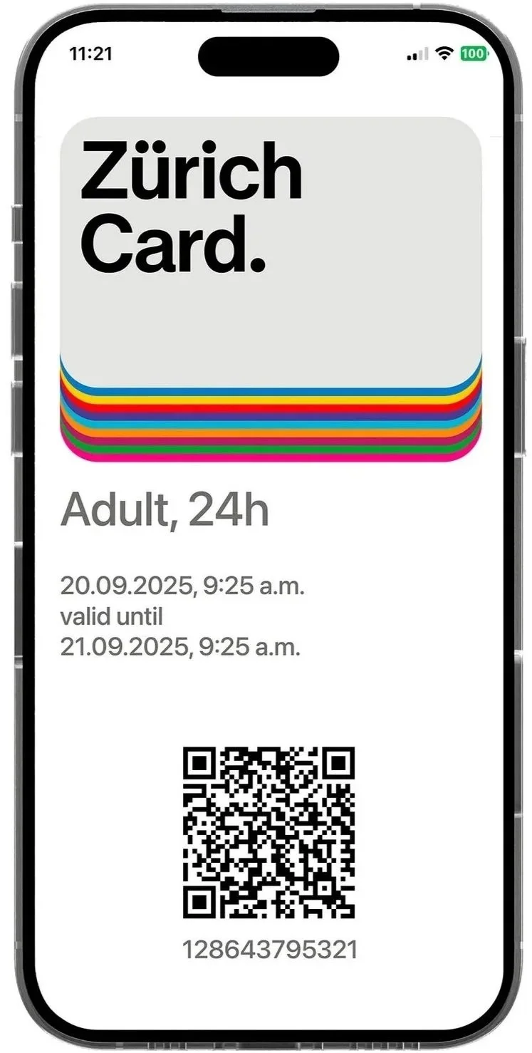
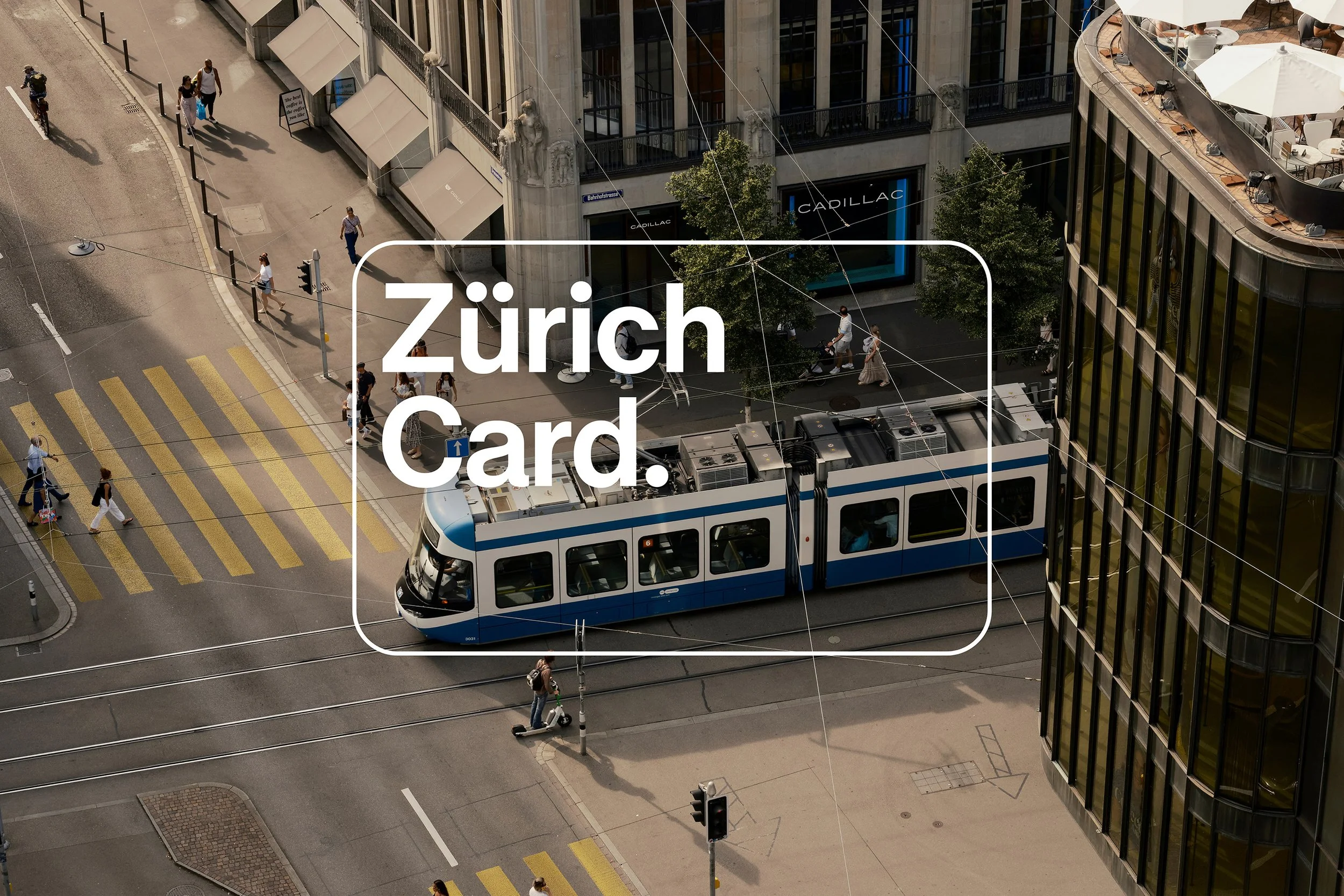
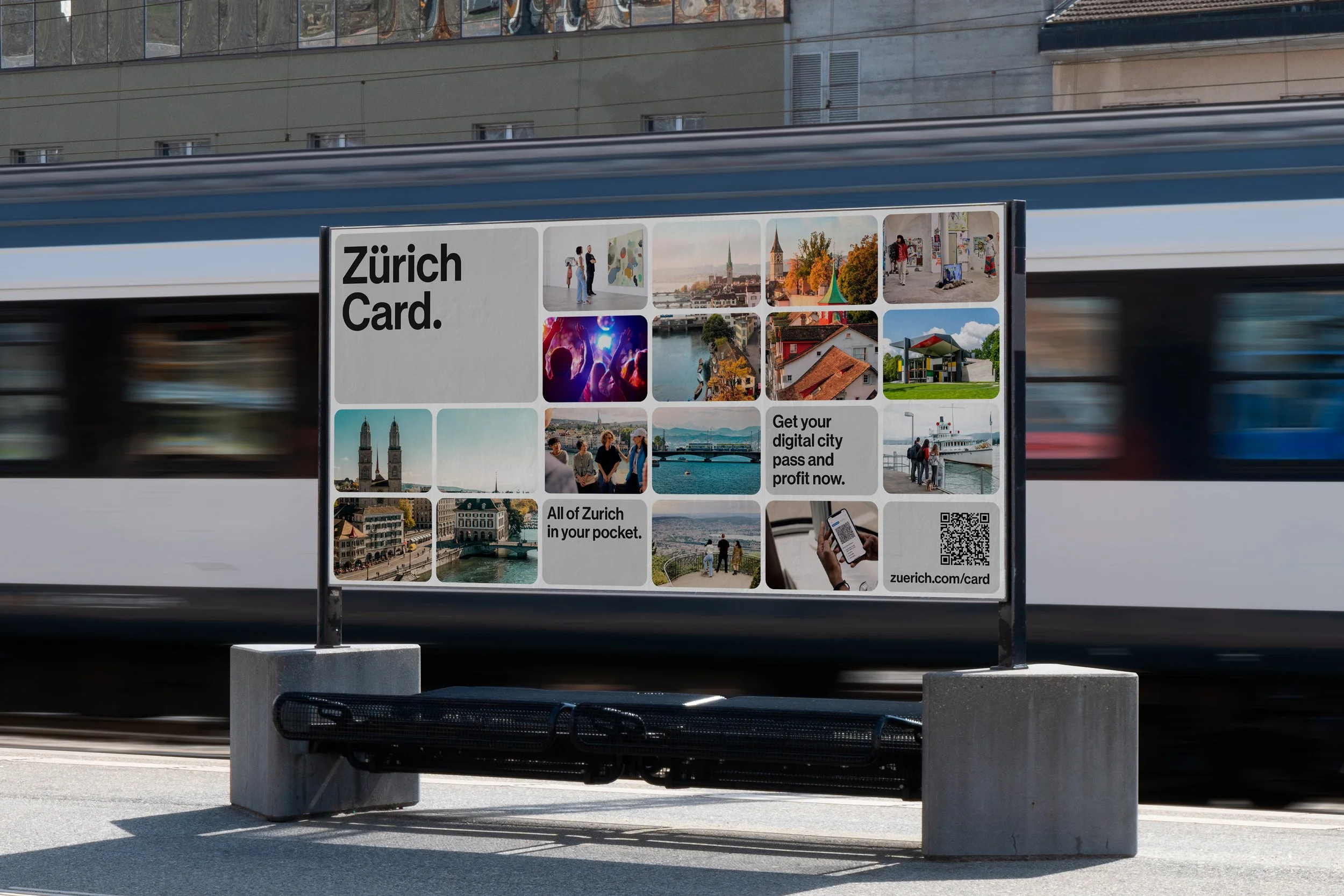
zürich card
the design for the official city pass combines a stylised card shape with an emotional imagery, making the advantages of the card visible. the design creates a visual stage to showcase the numerous benefits of the zürich card in an emotional and flexible way. see more ›


future proof
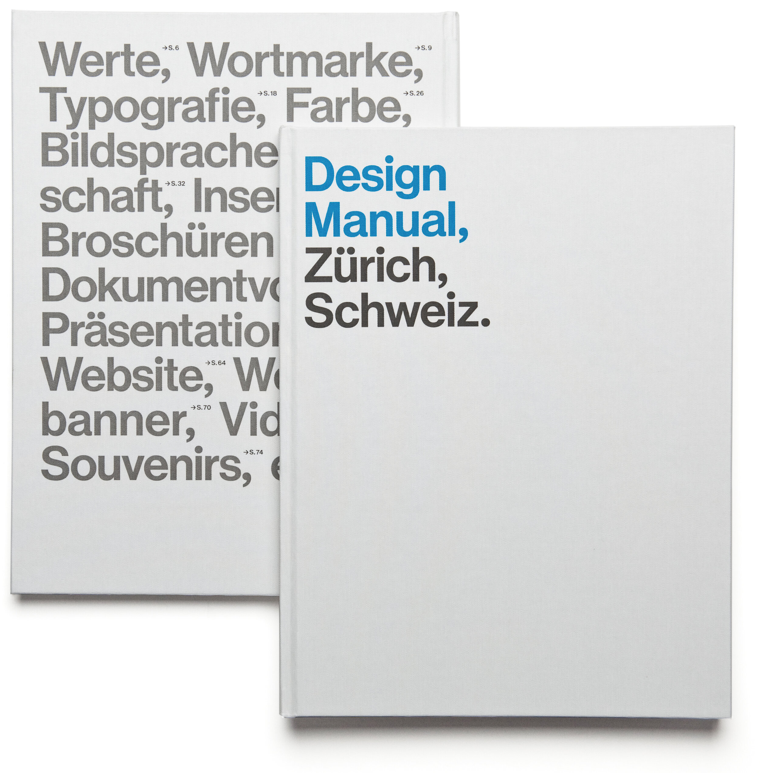
an extensive design manual documents the basic rules of the identity and sets the guidelines for future applications.


zurich experience
the identity for zurich experience – a summit about urban tourism – is built on the branding of zurich tourism. see more ›
credits
creative direction & art direction: studio marcus kraft, concept & design: studio marcus kraft in collaboration with atlas studio, text: rainer brenner, custom typeface: commercial type, video animation: josh schaub, web development: amazee labs
zurich tourism: martin sturzenegger (director), nathalie lüthi (head of marketing), anita lutz (graphic designer & brand manager), matthias drabe (team leader online marketing)
related