
on running
development of the corporate identity and branding with its iconic logo and core design elements (made at raffinerie). from small beginnings in zurich, switzerland, ‹on› set out with a big ambition: to change the world of running. today, millions of runners in over 60 countries use the shoes with the special sole technology.


the brand was started based on one idea: ‹soft landings followed by explosive take-offs.› on wanted to revolutionize the sensation of running, and began calling it, ‹running on clouds.›
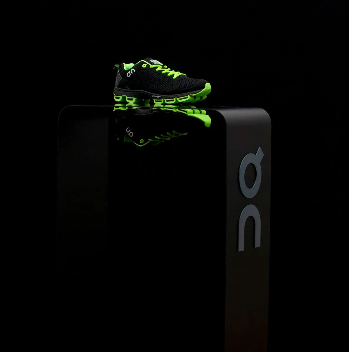
all identity elements were designed for a flexible and long lasting branding. our art directed photographic style of the ‹flying shoe› is still being used today (at the time, it was a novelty and was soon copied by numerous other brands). the all-black packaging used to be a favourite of the customers.

since 2021, the company is listed on the new york stock exchange. today, on is worn by runners worldwide and has also developed into a brand for an active lifestyle. with offices across the globe, the brand is expanding rapidly and is tapping into new fields. swiss tennis icon roger federer is involved in the product development and expansion of the brand.

project details
-
on was founded in zurich, switzerland, with the ambition to change the world of running. the brand set out to rethink the running experience through a distinctive shoe concept designed around soft landings and explosive take-offs. the challenge was to translate this innovative approach into a recognisable brand identity that could stand apart in the competitive running market.
-
the brand was built around the idea of “running on clouds”. the concept captures the contrast between a soft landing and a powerful take-off, expressing the distinctive sensation at the heart of on’s running technology. this idea became the foundation for a clear and memorable visual identity.
-
the corporate identity combines an iconic logo with a set of flexible core design elements. designed to be adaptable and long-lasting, the visual system creates a consistent brand presence across different media and applications.
a defining element of the art direction is the ‹flying shoe› photography, which visualises the feeling of movement and lightness central to the brand. the packaging extends the identity into the product experience, combining functional design with a distinctive visual character.
-
from its beginnings in zurich, on has grown into an international running and active-lifestyle brand, worn by runners around the world. the original identity established a recognisable visual foundation that continues to support the brand as it expands into new products, audiences and markets.
-
client: on
project: corporate identity and branding
year: 2010
origin: zurich, switzerland
services: brand identity, logo design, art direction, graphic design, product packaging and photographic art direction -
concept, art direction & design made at raffinerie with nenad kovacic, florian streit, reto ehrbar & christian haas, product design: thilo alex brunner
on: david allemann, caspar coppetti, olivier bernhard
related projects

klangwelt toggenburg

swiss banknotes proposal
