
freitag f-abric
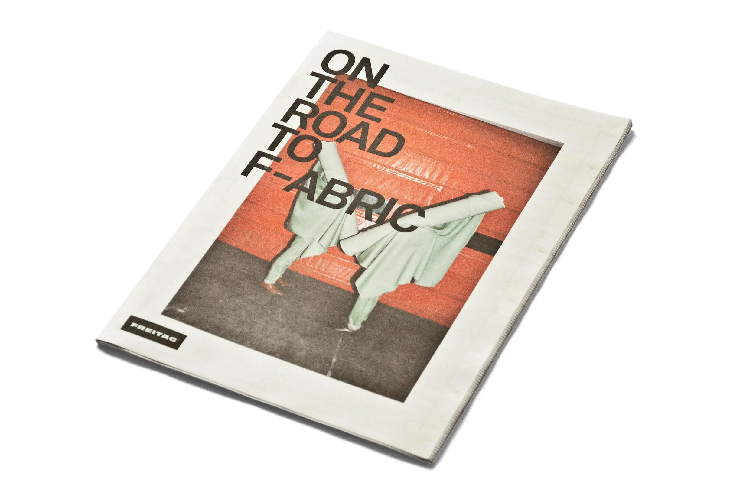
visual communication for a new business branch of bag manufacturer freitag: f-abric. these are textile fabrics that grow and are processed in europe, and which are 100% biodegradable. we created the visual appearance for f-abric in close collaboration with the two founders of the company, daniel and markus freitag.
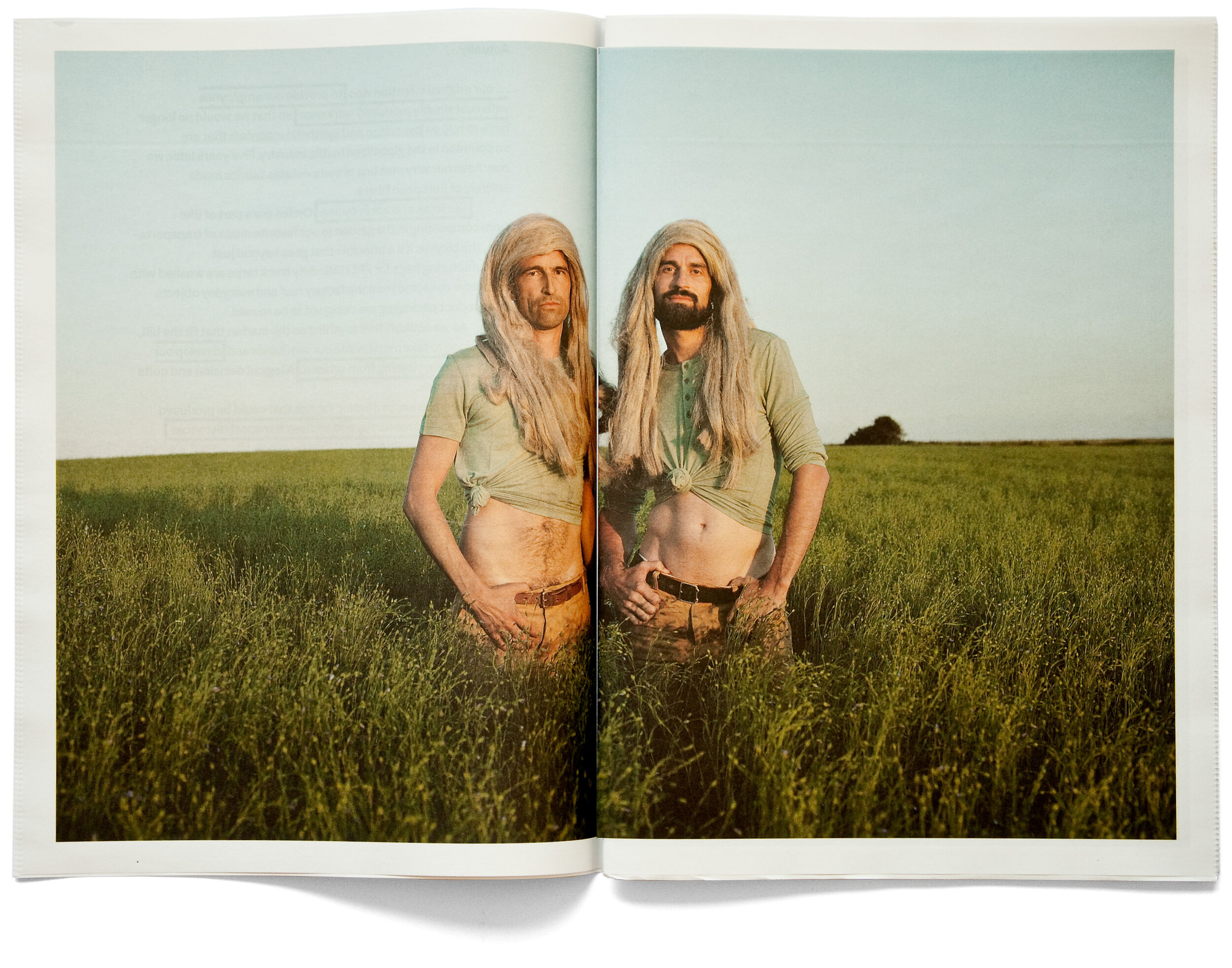
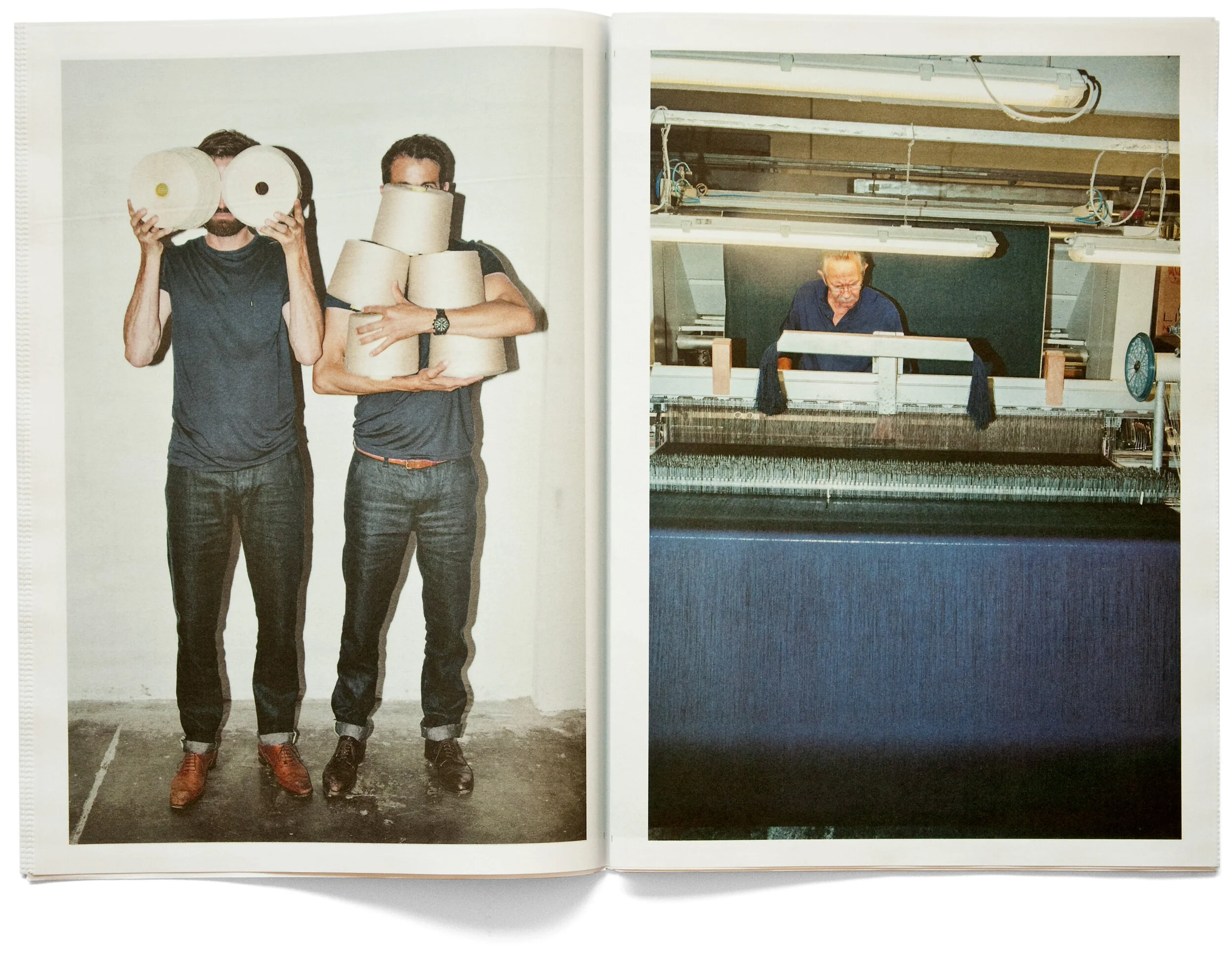
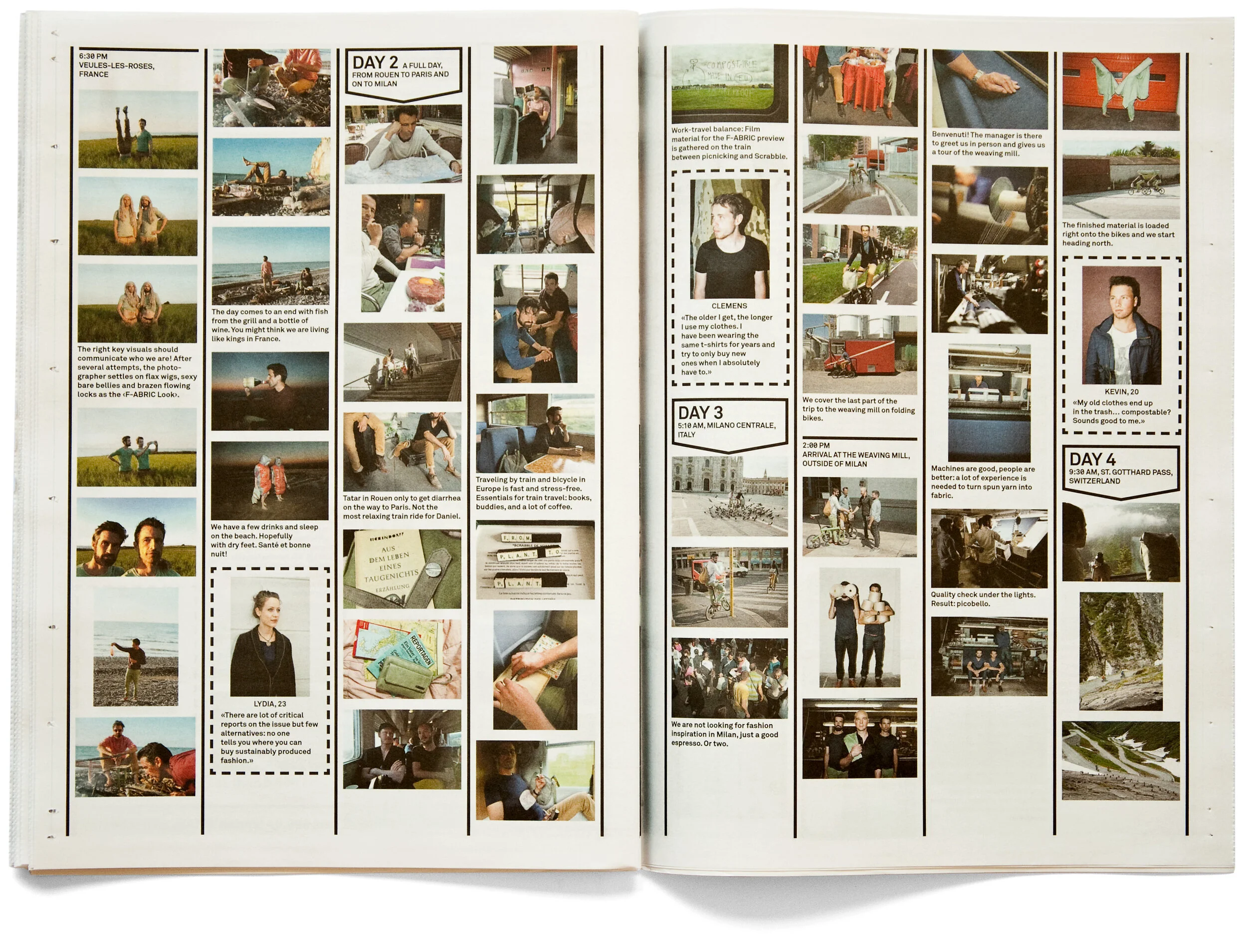
core medium of communication is a newspaper that explains the project extensively on 80 pages. a highlight is the trip of the freitag brothers by bicycle and train: they traced the production sites of a pair of pants in france, germany, italy, poland and switzerland. this trip was captured photographically and on film and makes for a big picture pool for the print and online media.






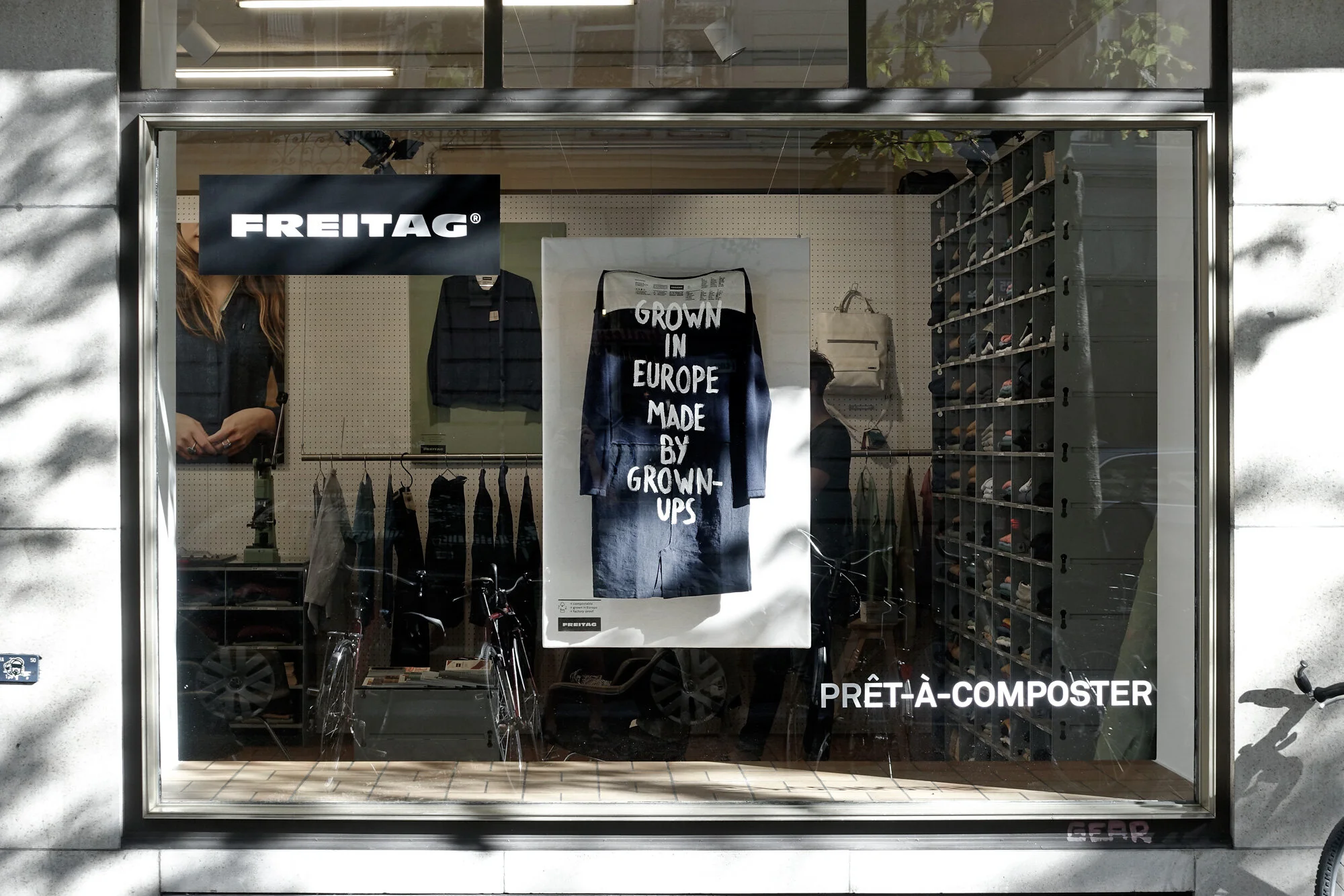


the f-abric products are produced with such incredible consequence that this also had to be mirrored by the communication: we have, for instance, printed all relevant product information on the inside of the fabric and have thus dispensed with any unnecessary care labels. all hangtags are made of waste paper.


project details
-
freitag f-abric is a textile collection developed by swiss bag manufacturer freitag. made from fibres grown and processed in europe, the fabrics are designed to be fully biodegradable. the challenge was to create a visual communication system that expressed the product’s material origins and uncompromising approach to sustainability.
-
developed in close collaboration with freitag founders daniel and markus freitag, the visual communication makes the production process part of the story. at its centre is an 80-page newspaper that documents the materials, people and places behind f-abric, offering an in-depth look at how the products are made.
-
the design puts transparency and materiality first. a photographic and filmic record of the freitag brothers travelling by bicycle and train through france, germany, italy, poland and switzerland traces the production journey of a pair of trousers. this road trip created an extensive image library for print and digital communication.
the sustainability principle also informed the smallest details: product information is printed directly on the inside of the fabric, eliminating separate care labels, while hangtags are made from waste paper.
-
the visual identity was applied across the newspaper, print and online media, product labelling, hangtags, campaign photography and film. the result is a coherent communication system in which the story, materials and practical details reflect the same approach as the product itself.
-
a distinctive visual presence for freitag’s f-abric collection that communicates its european production process and biodegradable materials through editorial storytelling, photography, film and considered product details.Item description
-
client: freitag
year: 2014
services: concept, art direction, visual identity, editorial design, photography direction, film, campaign design, product labelling, print and digital communication
location: zurich, switzerland; production journey across france, germany, italy, poland and switzerland -
concept, art direction & design: studio marcus kraft, lukas wassmann (photography road trip), yves scagliola (road trip movie), nadine ottawa (inside out campaign), pascal grob (look shots), rainer brenner (text), simon trüb, marlon ilg (illustrations)
freitag: daniel & markus freitag (creative direction), daniel rohrer (overall responsibility), lukas widmer (production road trip), david keller (text), mario stadelmann, leandro destefani (store design)